
Objective
This is the second part of the project named “The Evaluation of NYC Green Infrastructure’s Performance in Mitigating Combined Sewer Overflow and Hudson River Pollution”. This project focuses on the Hudson River near Manhattan. The first part is to determine the effectiveness of Green Infrastructure (GI) on stormwater runoff and combined sewer overflow (CSOs) control under extreme events. If GI no longer functions properly, stormwater and sewage will flow to a nearby river without water treatment and eventually pollute the river. Therefore, the second part is to create a model to analyze the wastewater influx into the waterway.
Combined Sewer Overflow in Manhattan
Background
– W.H.Auden
According to the NYC Department of Environmental Protection (DEP), the harbor water quality (WQ) dataset is collected by The Harbor Survey Program which monitors the regional water quality in different monitoring stations [NYC DEP, 2015]. The stations’ record information of rivers including their temperatures, salinities, dissolve oxygens (DO), coliform cells, pH levels, enterococci bacteria cells, etc. In this case, we will analyze several significant WQ parameters: DO measure with the Winkler method, coliform cells, and enterococci bacteria cells. DO is oxygen dissolved in water and will be used for the respiration of aquatic organisms. Coliform cells are bacteria found in organisms’ intestines and as indicator organisms to fecal contaminants like pathogenic bacteria [NYC DEP, 2015]. Enterococci bacteria cells are also indicators of fecal contaminants in the streams and rivers [NYC DEP, 2015]. Those cells are considered as sewage-related pollutants.
Methodology
The NYC WQ data (last access was on May 30, 2020) and NYC geological features such as water bodies and city boundaries are acquired from NYC Open Data. The CSOs data is acquired from the NYS Data Gov.
Since our study focus on Hudson River, we begin to utilize ArcGIS displaying NYC geological features as well as inputting WQ sampling stations and CSOs locations. Every data include geological location like latitude and longitude, therefore ArcGIS able to display them as a map. The video will show the process of obtaining a map and the data of WQ and CSOs in the Hudson River. The result of the map is shown in Figure 1a.
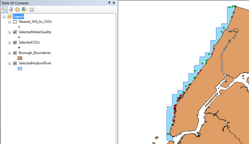
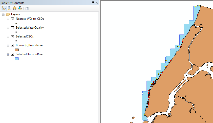
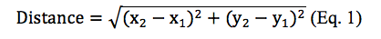
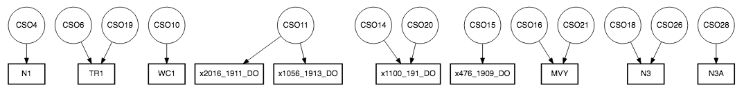
Figure 1a illustrates that there are more CSOs locations than WQ sampling stations and some WQ sampling stations are close to each other. This will lead to repetitive WQ sampling observations in one CSO. Therefore, the next step is to identify the closet WQ sampling station to each CSOs and obtain those WQ data. We used distance formula (shown as Equation 1) to calculate the distance between each WQ sampling station to each CSOs location in which x2 and x1 are longitudes of WQ sampling stations and CSOs locations and y2 and y1 are latitudes of WQ sampling stations and CSOs locations.
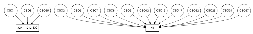
RStudio is a software that allows us to perform statistical analysis of the data and we use it to perform distance calculation and later experiments. With the software and the equation, we limit our study to 85 WQ sampling data. Figure 1b shows the nearest WQ sampling stations to each CSOs location on a map and Figure 2 demonstrates this with a flow chart.
The WQ sampling data will be compared with rainfall data (from 1949 to 2019) and sewer overflow data from the GI section (first part of the big project). Lack of actual CSOs’ values to the river leads us to assume that the overflow water data from the GI section behaves similarly to actual CSOs’ values. In this way, we can observe two connections: one is between rainfall and WQ and another is between Q (stormwater overflow) and WQ. With RStudio, we begin with summing the hourly rainfall data into daily rainfall data since our WQ data is a daily data. Specific and available daily rainfall values will be inputted to WQ data if the dates of both data are matched. Missing rainfall values are inputted based on the daily station details from NOAA online climate data. The station’s name is NY CITY CENTRAL PARK, NY US. Two experiments are conducted to understand those connections.
We would also want to see the WQ under the daily extreme rainfall events. In other words, will WQ increase or decrease when it rains heavily that day? We assign an extreme rainfall quantile as the 99th percentile. In other words, rainfall that is greater than 99% of the original rainfall data will be considered as “Extreme”. If they are between 0 and 99th percentile, they are “Normal”. Otherwise, they are “None”. We found that none of the rainfall of these 85 WQ sampling data is considered extreme. Instead of understanding the connection between WQ and extreme rainfall events, we decide to understand the connections between WQ and seven days earlier rainfall and water flow.
Rainfall (or HPCP) with Seven days Earlier than WQ Date Experiment
We assume the WQ variations are a result of up to seven days earlier rainfall events. A separate data file named Seven_Days_Before_WQ is created include seven days before the WQ samplings dates. Daily rainfall values from original daily rainfall data will be aggregated to that datafile if they are available and the dates of both data are matched. The unavailable rainfall data are filled based on the NOAA website (mention earlier). Later, we accumulate the rainfall values (HPCP) using the following equation:
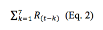
what R is the rainfall value, t is WQ sampling date and k is a value from 1 day to 7 days that is being subtracted by t. Each WQ sampling date will have an aggregated rainfall day before move on to the next date.
Plotting all accumulated seven days earlier rainfall data and all WQ sampling data will generate a lot of combinations. So, we choose to study only 5 WQ sampling data (Winkler Method Top Dissolve Oxygen (DO), Winkler Method Bottom DO, Top Total Coliform Cells, Top Bottom Coliform Cells, and Top Enterococci Bacteria Cells). Bottom Enterococci Bacteria Cells is not included because all values are 0. In order to choose the best day earlier to compare with WQ, we can apply a regression analysis by identifying the coefficient of determination (or R-squared) for each day earlier.
Regression analysis is a statistical technique to estimate the relationship between two variables of interest and R-square is a statistical measure to show the goodness of the model to the data. Higher R-square refers to a better fit for a model and a higher percentage of variance in dependent variables that are can be explained by the independent variables [R-squared, 2020]. A model with high R-square can be used as a predictive model. However, regression analysis never demonstrates causation between the variables. R-square can be calculated by squaring the correlation of coefficient (r). The correlation coefficient is another statistical measure to show the relationship between the two variables. After obtaining the best day earlier for each WQ data, we plot the WQ as a function of the corresponding best day earlier HPCP on a logarithm scale. We also separate the HPCP into a rainfall event and no rainfall event. Then, we plot the corresponding WQ as a function of each of the events with boxplots.
Water Flow (Q) with Seven days Earlier than WQ date Experiment
The data of Q is obtained from an updated Seven_Days_Before_WQ data file which has the calculation of Q before and after green infrastructure (GI). Q is calculated from the first part of the big project that focuses on the effectiveness of GI on water flow control. We will follow a similar procedure to the HPCP experiment. Since each Q is calculated with respect to different curve numbers (total is 21) on the same date, we also accumulate Q with respect to those curve numbers with a similar calculation as the HPCP experiment. Then, we make similar plots of WQ as a function of Q and boxplots of with or without Q.
Source: http://www.chiron.no/en/specialist-areas/environmental-analysis/
Results
HPCP (or Rainfall) with Seven days Earlier than WQ date Experiment
Figure 3 demonstrates the scatterplots of the best day earlier HPCP with the corresponding WQ on the logarithm scale. In each of the scatterplots, the data is spread away from each other and does not show a linear pattern. This means that we should expect to have a low R-square in each of the scatterplots. The model should be improved by knowing the approximate day of HPCP for all corresponding WQ measurements and more accurate data for coliform cells and enterococci bacteria cells.
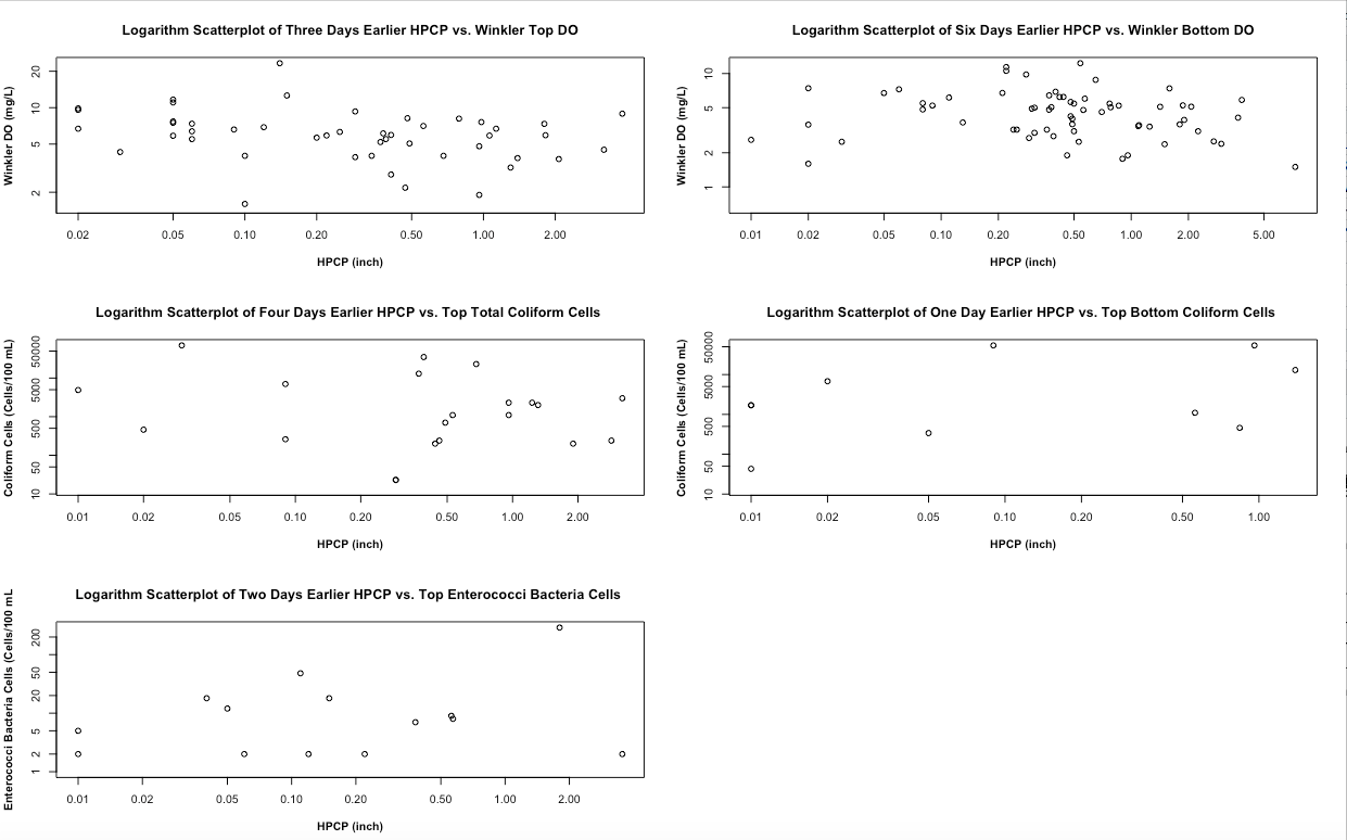
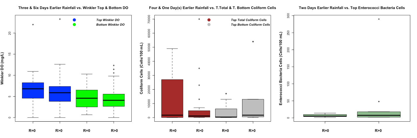
Figure 4 demonstrates different WQ boxplots under rainfall and no rainfall events. In the Winkler DO boxplot, the top Winkler DO is higher than the bottom Winkler DO. As the water depth increases, DO will get reduced by aquatic organisms breathing and microbial decomposing the organic material with it [Fondriest, 2013]. A boxplot can reveal different percentage of the data (0%, 25%, 50%, 75%, and 100%). Excluding the outliers (the point that is outside of the boxplot), 75% of Winkler top and bottom DO is higher during no rainfall event compare during rainfall event as we expect. In the coliform cell boxplot, it demonstrates that the top total coliform cells (or total coliform top sample according to the data dictionary of harbor water quality) are higher during no rainfall event. However, the top-bottom coliform cells (or total coliform bottom according to the data dictionary of harbor water quality) are higher during the rainfall event rather than no rainfall event. In the enterococci bacteria cells boxplot, the top enterococci bacteria cells are higher during rainfall event. For the last two boxplots, we expect to have a higher level of polluted cells in the top and bottom water under rainfall events.
Q (or Water Flow) with Seven days Earlier than WQ date Experiment
Figure 5 demonstrates the scatterplots of the best day earlier Q with the corresponding WQ on the logarithm scale. We choose to illustrate the Q with a curve number of 0.66 because the scatterplots with different curve numbers show the same plots. Figure 5 shows the same pattern as Figure 3 with different x-axis values because only the x-axis is changing from HPCP to Q. This also means that we should expect to have a low R-square in the water flow model and require further testing.
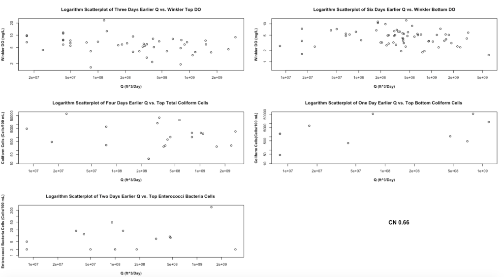
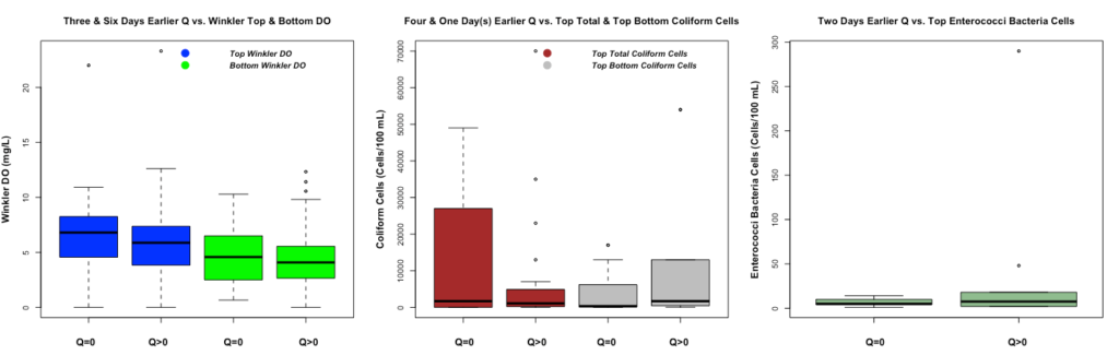
Figure 6 demonstrates different WQ boxplots under water overflow and no water overflow events. All boxplots demonstrate the same results as Figure 4 since only x variables change from HPCP to Q. Therefore, 75% of Winkler top and bottom DO is higher during no water overflow event as we expect. The top total coliform cells are higher during no water flow event. However, the top-bottom coliform cells are higher during water overflow events. The top enterococci bacteria cells are higher during water overflow events. For the last two boxplots, we expect to have a higher level of polluted cells in the top and bottom water under the water overflow events.
Source: https://www.westhawaiitoday.com/2019/11/06/hawaii-news/supreme-court-leans-toward-expanding-clean-water-act-to-protect-oceans-from-wastewater/
Summary
The results of the HPCP and Q experiment show the same trend. Both experiments reveal a low R-square between HPCP (or Q) and WQ. This might refer to future improvements on the model to better fit with the data. In the conditional analysis using visual boxplots (essentially, conditional probability distributions), both HPCP and Q demonstrates higher DO under no rainfall (or water overflow) event and the top DO are expected to be higher than bottom DO. In contrast, enterococci bacterial cell boxplots show larger cells that happen under the rainfall event. Coliform cell boxplots illustrate both patterns in either top or bottom cells. These results also lead to further improvement in the model with more accurate data such as actual water flow data from CSOs. In the end, the model still reveals the influence of wastewater on the available DO and enterococci cells.
Acknowledgement
This research was supported by the Opportunities in Research and Creative Arts Program (ORCA). Special thanks to mentor Naresh Devineni who has been assisted this project throughout the program. We also acknowledge NYC OpenData and NYS Data Gov for providing the data. Software used in this project is available to us by The City College of New York (CCNY).
Reference
Fondriest Environmental, Inc. “Dissolved Oxygen.” Fundamentals of Environmental Measurements. 19 Nov. 2013. Web. < https://www.fondriest.com/environmental-measurements/parameters/water-quality/dissolved-oxygen/ >.
NYC DEP. (2015, January 25). Harbor Water Quality. Retrieved May 30, 2020, from https://data.cityofnewyork.us/Environment/Harbor-Water-Quality/5uug-f49n
R-Squared – Definition, Interpretation, and How to Calculate. (2020, June 17). Retrieved August 24, 2020, from https://corporatefinanceinstitute.com/resources/knowledge/other/r-squared/

This entry is licensed under a Creative Commons Attribution-NonCommercial-ShareAlike 4.0 International license.
Pingback: Measuring Effectiveness of Green Infrastructure – ORCA 2020 Summer Research Showcase